Example(5): Distance Based Anomaly Detection using Euclidean Distance
This example illustrates how to leverage the capabilities of osbad for
distance-based anomaly detection using osbad.dbad with multivariate
datasets. Although distance-based metrics are commonly integrated into
various ML-based anomaly detection frameworks, this example shows a simpler
adaptation using centroid-based distance calculation. In scenarios where
low latency, model interpretability, or limited computational resources are
critical, such as in process-control hardware or embedded monitoring systems,
a straightforward centroid-based method offers a more practical and efficient
alternative to computationally intensive ML algorithms.
The following example of running a hyperparameter tuning and anomaly detection
pipeline is also provided as a notebook in
distance/distance_01_euclidan.ipynb.
Step-1: Load libraries
Import the libraries into your local development environment, including the
osbad library for benchmarking anomaly detection.
Pathis used for robust, cross-platform file paths.duckdbis the embedded analytical database engine storing the dataset.bconf: project config utilities (e.g., where to write artifacts).BenchDB: a thin layer around DuckDB that provides convenience loaders.ModelRunner,modval: modeling and model validation helpers for benchmarking study in this project.dbad: utilities for computing distances, identifying outliers and visualizing the results.
# Standard libraries
from pathlib import Path

# Third-party libraries
import duckdb
import pandas as pd
import numpy as np
import matplotlib.pyplot as plt

# Custom osbad library for anomaly detection
import osbad.config as bconf
import osbad.modval as modval
from osbad.database import BenchDB
from osbad.model import ModelRunner

# importing distance based anomaly detection utilities
from osbad import dbad
Step-2: Load Benchmarking Dataset
Pick a specific cell based on the
cell_index, which identifies the experimental data corresponding to one unique cell.Create an artifacts folder for that cell, where you can save figures, tables, or model outputs related to this cell.
Initialize
BenchDBfor the selected cell and path to the DuckDB file:train_dataset_severson.db.Loads all data related to
selected_cell_labelfrom the training partition.
# Get the cell-ID from cell_inventory
selected_cell_label = "2017-05-12_5_4C-70per_3C_CH17"

# Create a subfolder to store fig output
# corresponding to each cell-index
selected_cell_artifacts_dir = bconf.artifacts_output_dir(
    selected_cell_label)

  # Path to the DuckDB file:
  # "train_dataset_severson.db"
  db_filepath = (
      Path.cwd()
      .parent
      .joinpath("database","train_dataset_severson.db"))

  # Import the BenchDB class
  # Load only the dataset based on the selected cell
  benchdb = BenchDB(
      db_filepath,
      selected_cell_label)

  # load the benchmarking dataset
  df_selected_cell = benchdb.load_benchmark_dataset(
      dataset_type="train")
Step-3: Load the Features DB
Load the features (e.g.,
log_max_diff_dQ,log_max_diff_dV) based onselected_cell_labelinBenchDB.
# Define the filepath to ``train_features_severson.db``
# DuckDB instance.
db_features_filepath = (
    Path.cwd()
    .parent
    .joinpath("database","train_features_severson.db"))

# Load only the training features dataset
df_features_per_cell = benchdb.load_features_db(
    db_features_filepath,
    dataset_type="train")
Step-4: Select features and calculate distribution centroid
Builds a ModelRunner with the cell label, feature DataFrame, and selected features.
Calls
runner.create_model_x_input()to get the X matrix (shape: n_cycles × n_features).Calculate centroid on the feature distribution based on the median value. shape of
centroidshould be (number of selected features, ).
# The two features implemented in this example
selected_feature_cols = (
  "log_max_diff_dQ",
  "log_max_diff_dV")

# Create a ModelRunner instance based on selected_cell_label,
# df_features_per_cell and
# selected_feature_cols
runner = ModelRunner(
      cell_label=selected_cell_label,
      df_input_features=df_features_per_cell,
      selected_feature_cols=selected_feature_cols)

# get features and calculate centroid
features = runner.create_model_x_input()
centroid = np.median(features, axis=0)
Step-5: Calculate distance from centroid and detect outliers
Select one of the available distance metrics to use for centroid based anomaly detection. This includes
euclidean,manhattan,minkowskiandmahalanobisdistances.dbadmodule proviedcalculate_distancemethod which measures the distance between centroid and each data point in the distribution and return an array of shape (n_cycles,). It also returns the maximum distance (farthest point from centroid) for distance normalization.predict_outliersmethod provides functionality to detects outliers using the threshold based on Median Absolute Deviation (MAD) method.
# select which distance-metric to use
metric_name= "euclidean"

# calculate euclidean distance using dbad module
euclidean_dist, max_euclidean_dist = dbad.calculate_distance(
    metric_name=metric_name,
    features=features,
    centroid=centroid,
    norm=True)

# predict outlier cycles based on distance. Also returns threshold distance
# used, calculated based on MAD
(pred_outlier_indices,
pred_outlier_distance,
pred_outlier_features,
euclidean_threshold) = dbad.predict_outliers(
                            distance=euclidean_dist,
                            features= features,
                            mad_threshold=3)

print("\nPredicted Anomalous Cycles:", pred_outlier_indices)
print("Euclidean distance for Outlier Cycles:", pred_outlier_distance)
print("Euclidean Threshold:", euclidean_threshold)
Step-6: Plot distance score mapping and contour
pred_outlier_indicesis a list of cycle indices predicted as anomalous by the centroid based anomaly detection method.A new column,
outlier_distance, is added to store the outliers distance score computed by the model, making it easy to track flagged cycles.runner.create_2d_mesh_grid()generates a 2D mesh grid, which is a structured set of points covering the feature space. The mesh grid is used to calculate distances and visualize the score map. The returned values include:xx and yy: Coordinate matrices for plotting.
meshgrid: Combined grid points for distance computation.
calculate_distanceis again utilized to get the euclidean distance between each point in the mesh grid and the centroid of the feature space.max_distanceis used for normalization andnormcan be set toTrueto ensures distances are scaled between 0 and 1.plot_distance_score_mapcreates a visual representation of the distance score map.
# Select rows from df_features_per_cell where 'cycle_index' matches the
# predicted outlier indices and create a copy to avoid modifying the original
# DataFrame.
df_outliers_pred = df_features_per_cell[
    df_features_per_cell["cycle_index"].isin(pred_outlier_indices)
].copy()

# Store the predicted outlier distances in df.
df_outliers_pred["outlier_distance"] = pred_outlier_distance

# Create a 2D mesh grid for plotting the distance score map.
# This returns xx, yy coordinates and the combined meshgrid points.
xx, yy, meshgrid = runner.create_2d_mesh_grid()

# Calculate the Euclidean distance for each point in the mesh grid relative
# to the centroid. The distance is normalized using max_euclidean_dist.
grid_euclidean_dist = dbad.calculate_distance(
    metric_name=metric_name,
    features=meshgrid,
    centroid=centroid,
    max_distance=max_euclidean_dist,
    norm=True
)

# Plot the distance score map using the calculated distances.
axplot = dbad.plot_distance_score_map(
    meshgrid_distance=grid_euclidean_dist,
    xx=xx,
    yy=yy,
    features=features,
    xoutliers=df_outliers_pred["log_max_diff_dQ"],
    youtliers=df_outliers_pred["log_max_diff_dV"],
    centroid=centroid,
    threshold=euclidean_threshold,
    pred_outlier_indices=pred_outlier_indices,
    norm=True
)

# Set the title of the plot.
axplot.set_title('Euclidean Distance', fontsize=12)

# Generate a filename for the output figure
filename = f"{metric_name}_dist_map"
output_fig_filename = filename + "_" + selected_cell_label + ".png"

# Define the full path for saving the figure.
fig_output_path = selected_cell_artifacts.joinpath(output_fig_filename)

# Save the figure with high resolution and tight bounding box.
plt.savefig(
    fig_output_path,
    dpi=600,
    bbox_inches="tight"
)

# Display the plot.
plt.show()

Background Heatmap:
Dark Red Regions: Indicate a high normalized distance from the centroid. These areas are more likely to contain anomalies.
Blue Regions: Represent low normalized distance (close to the centroid), corresponding to normal cycles. The color gradient (blue → white → red) shows increasing anomaly likelihood based on Euclidean distance.
Dashed Black Contour:
Represents the decision boundary defined by the Euclidean distance threshold.
Contour Shape:
For Euclidean distance, the contour is circular because the metric treats all directions equally (isotropic).
If a different metric is used (e.g., Mahalanobis distance), the contour would become elliptical, reflecting feature correlations and scaling differences.
For Manhattan distance, the contour would appear more like a diamond shape.
This contour visually separates normal regions (inside) from anomalous regions (outside).
Red Cross:
Marks the centroid of the feature space.
Black Dots:
Represent the majority of normal cycles (inlier data) clustered near the centroid.
Yellow Stars with Labels:
Highlight the detected anomalous cycles: 0, 40, 147, 148. Their positions in the 2D feature space (log-transformed ΔQ vs. ΔV) show how far they deviate from typical battery behavior.
Colorbar (Right):
Quantifies the normalized Euclidean distance from the centroid. 0 = normal (close to centroid) and 1 = highly anomalous (far from centroid).
Annotation Box:
Summarizes the predicted anomalous cycles: [0, 40, 147, 148].
Interpretation:
Cycles 0 and 40 exhibit unusually high voltage deviations.
Cycles 147 and 148 show strong deviations in charge capacity.
These anomalies may correspond to battery degradation events, sensor errors, or experimental disturbances.
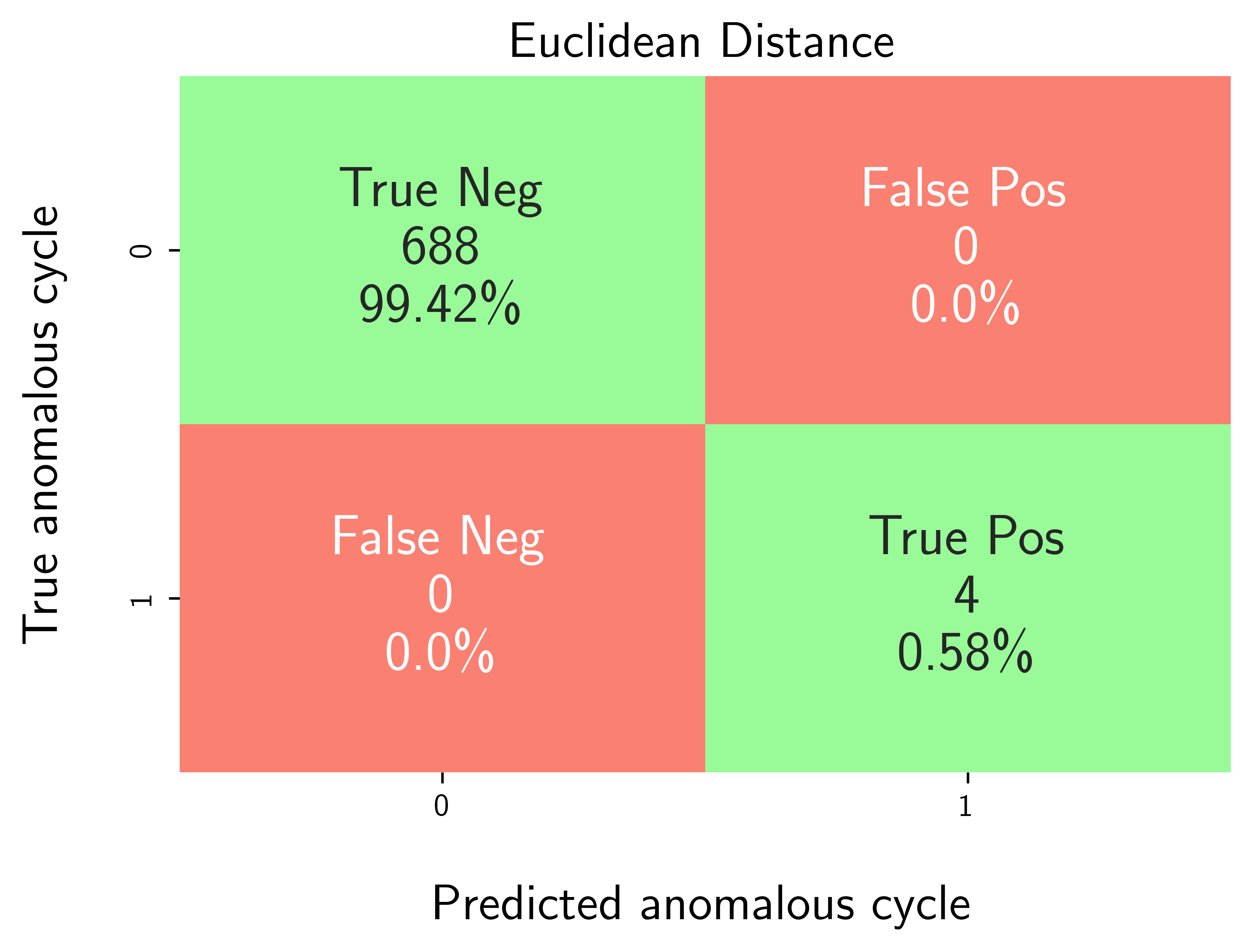
Step-7: Model performance evaluation
Map predicted outlier indices to the benchmark dataset:
df_selected_cellholds cycle-level records and the ground-truth label (e.g.,outlier= 1 for anomalous cycles, else 0).pred_outlier_indicesis the list of cycle indices flagged by the model.
modval.evaluate_pred_outliers(...)returns a tidy DataFrame with:cycle_index: Cell discharge cycle indextrue_outlier: ground truth (0/1).pred_outlier: model prediction (0/1) for the same cycles.
modval.generate_confusion_matrix(...)aggregates counts of:True Negative (TN): predicted 0, truth 0.False Positive (FP): predicted 1, truth 0.False Negative (FN): predicted 0, truth 1.True Positive (TP): predicted 1, truth 1.
# Map the predicted outlier indices
df_eval_outlier = modval.evaluate_pred_outliers(
  df_benchmark=df_selected_cell,
  outlier_cycle_index=pred_outlier_indices)

# generate confusion matrix
axplot = modval.generate_confusion_matrix(
  y_true=df_eval_outlier["true_outlier"],
  y_pred=df_eval_outlier["pred_outlier"])

axplot.set_title(
    "Euclidean Distance",
    fontsize=16)

output_fig_filename = (
    "conf_matrix_euclidean_"
    + selected_cell_label
    + ".png")

fig_output_path = (
    selected_cell_artifacts
    .joinpath(output_fig_filename))

plt.savefig(
    fig_output_path,
    dpi=600,
    bbox_inches="tight")

plt.show()